
Refreshed identity
Municipality of Rotterdam
Positive change
What we did
Visit the wesite
Want to work with us?
Previous style
The previous style dates from 2008 and was mainly developed for offline use. Our most important task was to keep what was already good and to change only what needed to be improved.

Refreshed style
We redesigned various components of the identity. We simplified the logo to make it digital ready, darkened the primary colour green to create accessible contrast, developed an easy-to-read typeface and made a flexible grid for both online and offline use.
Logo simplified
To preserve the recognizability of the logo we didn’t change the shape. We did simplify the logo to improve its readibility; more transparancy, one color and a more compact typeface.
Social icon
For the social icons we developed a version of the logo based on the characteristic R. The waves were omitted in favor of positioning and readability.
Colors
The primary color green has been adapted to a color with a higher contrast value to meet accessibility standards. Aside from the primary colors we created a secondary color palet, which can be used for infographics, graphs and charts. We also developed a skin tone pallet for diversity and inclusivity.
Design premise
The style was designed to reflect the values and culture of decisiveness and no-nonsense pragmatism. We used angular shapes that are present in both the city and the port.

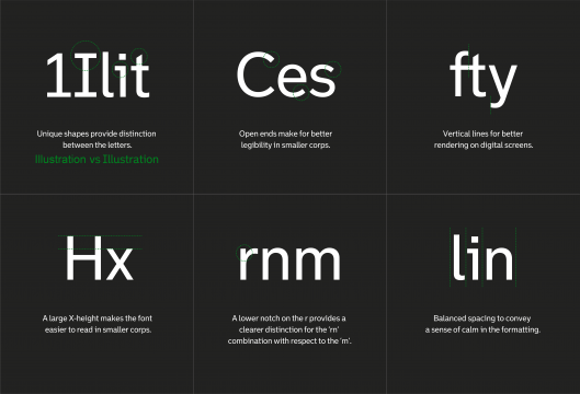
Designing the best readable font
More than 180 different nationalities are represented in Rotterdam. Approximately 20% of its citizens have some difficulty with the Dutch language. So, easy-to-read typography was one of the main objectives of the project. We developed the most clearly-legible typeface while still retaining the character of Rotterdam, reflecting its solidity and no-nonsense pragmatism. A typeface that is suitable for both on-line and off-line applications. This ensures a consistent and recognizable brand experience, even if the sender is not immediately visible.
Grid and design language
To communicate through different media, flexible design is required. We developed a responsive grid, which makes sure the design looks good in any format and on every device, contributing to a consistent user experience.


Infographics, tables and icons
To create consistent icons and charts we developed a grid, set up in 32x32 pixels. By using this grid both 2D and isometric 3D-shapes can be developed. Subsequently, these shapes can be used in elaborate infographics.

Applied
The refreshed style is implemented in on- and offline touch-points.


